 notabene
 Customize the look
notabene runs from the package — you never fork its UI. Everything below is config-driven instead:
- Branding — logo, favicon, social image.
- Design tokens — override the
--nb-*custom properties (below). - Your own stylesheet — a CSS file loaded after the renderer’s styles.
- Fonts and images — a folder of your repo, served for that stylesheet.
- Code and diagrams — a Shiki theme for code blocks; Mermaid follows the tokens.
Outbound links (topbar, sidebar, footer) are not part of this: they’re repo data, not appearance — see navigation links.
theme: {
  // Quick overrides, no file needed. A plain value applies to BOTH color schemes;
  // a light-dark() pair customizes each: light on the left, dark on the right.
  tokens: { accent: "light-dark(#7c3aed, #b79bff)", radius: "4px" },
  css: "docs/notabene-theme.css",                 // or/and a full stylesheet
},
Both target the same contract; a typo’d token name throws at startup (never a silent no-op). The renderer’s own styles live in CSS cascade layers, so your un-layered CSS always wins — no specificity war, no ordering luck.
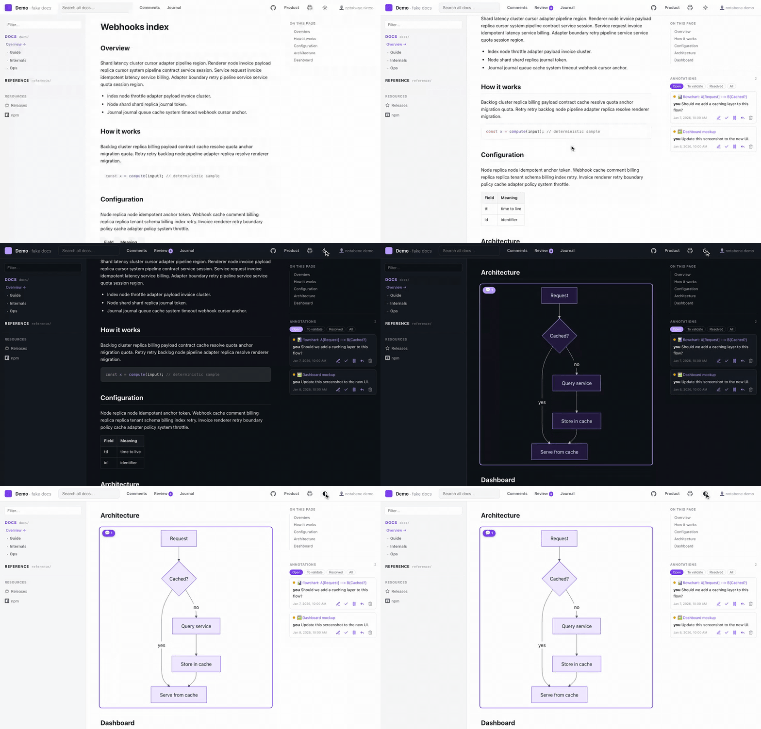
Everything follows that palette — the chrome, the code blocks and the diagrams — and the header’s scheme toggle switches it live, with no rebuild:
Diagrams
Mermaid diagrams follow the tokens out of the box: nodes are filled
with accent-soft and outlined with accent, labels use the prose color, edges
text-soft — and they re-render on the scheme toggle, so a dark-mode diagram is a real
dark diagram, not an inverted image. Nothing to configure.
If a diagram looks better with Mermaid’s own palette, opt out:
theme: { mermaid: false }, // back to Mermaid's built-in default/dark themesSyntax highlighting (theme.code)
Code blocks are highlighted at build time, so their colors are baked in — a light theme with dark code blocks is the usual mismatch. Name a Shiki theme and that changes:
theme: {
  code: "github-light",                            // same theme in both schemes
  // or one per scheme:
  code: { light: "github-light", dark: "vesper" },
},- With
codeset, both palettes ship as CSS variables and the scheme toggle recolors code instantly — no rebuild, no flash. - The code theme then owns the block background too (a light theme’s tokens on the
default dark slab would be unreadable).
--nb-code-bgstays the background for everyone who sets notheme.code. - PDF/print forces the light scheme, so your light code theme is what lands on paper.
- Unknown theme name → an error at startup, like every other theme knob.
Fonts and images (theme.assets)
A stylesheet usually needs files: a web font, a background, a texture. Point
theme.assets at a folder of your repo and it is served at the fixed path
/_nb/assets/… — in dev, in builds, and inside public artifacts,
so a published site stays self-contained (no CDN):
theme: { css: "docs/theme/site.css", assets: "docs/theme/assets" },/* docs/theme/site.css */
@font-face {
font-family: "Inter";
src: url("./assets/fonts/Inter.woff2") format("woff2"); /* ← relative, always */
}
:root { --nb-sans: "Inter", system-ui, sans-serif; }- Write
url()relative, never root-absolute. URLs resolve against the served stylesheet (/_nb/theme.css), not your source file — so./assets/…is the correct form, and it absorbs abasesub-path (GitHub Pages project site) for free, where/_nb/…would break. - Declare a dedicated folder, not
docs/: everything servable in it is emitted, referenced or not. - Only assets are served — fonts (
woff2,woff,ttf,otf), images (svg,png,jpg,webp,avif,gif,ico) andcss. Anything else (.md,.env, scripts), every dot-file, and any symlink pointing outside the folder is refused.
The token contract (--nb-*)
These custom properties are the public theming surface — stable across versions.
Color defaults are given as their light-dark(light, dark) pair:
| Token | Default (light / dark) | Role |
|---|---|---|
bg | #ffffff / #0e1116 | Page background |
bg-soft | #f6f7f9 / #151a21 | Panels, inputs |
bg-elev | #ffffff / #161b22 | Elevated surfaces (topbar, popovers) |
border | #e4e7ec / #272e38 | Hairlines |
text | #1c2024 / #e7ebf0 | Primary foreground |
text-soft | #5b6470 / #aab2bd | Secondary foreground |
text-faint | #8a929e / #768091 | Tertiary foreground |
accent | #2f6feb / #6ea0ff | Links, focus, highlights |
accent-soft | #e8f0ff / #182539 | Accent backgrounds |
ref / work | #2f6feb / #6ea0ff · #b5651d / #e0a060 | Space chips in search results |
code-bg | #0d1117 / #0b0e13 | Code block background — the default, when no theme.code is set (Shiki’s colors are then baked light-on-dark, so code stays dark in both schemes) |
topbar-h / sidebar-w / toc-w / content-max | 52px / 290px / 320px / responsive | Layout (scheme-invariant) |
radius | 8px | Corner rounding |
sans / mono | system stacks | Font families |
Every color token is a light-dark() pair — one declaration covers both schemes,
and the header’s scheme toggle (auto / light / dark, persisted per browser) flips
them all at once. A theme that changes colors does the same:
/* docs/notabene-theme.css */
:root {
  --nb-accent: light-dark(#7c3aed, #b79bff);
  --nb-accent-soft: light-dark(#f1e9ff, #241a3d);
}
The toggle works through color-scheme + a data-scheme attribute the renderer sets
on <html> — a theme must not set that attribute (or color-scheme on :root);
override tokens, and the toggle keeps working for free. light-dark() covers colors
only; for the rare non-color per-scheme styling, selecting on
:root[data-scheme="dark"] in your stylesheet is fine — it’s setting the attribute
that’s reserved.
Beyond tokens
Your stylesheet can also target a small set of stable hooks: .topbar, .brand,
.sidebar, .prose (the rendered content), .home-cards, .rail, plus the
navigation links — .nb-nav-link (any outbound
link), .nb-sidebar-links (the block under the space tree) and .site-footer.
Everything else — and every un-prefixed CSS variable — is internal and may change
between versions.
A theme styles those links; it never declares one. Nav entries, the footer text
and the branding assets are repo data (nav, branding at the top level of the config),
not appearance: a stylesheet you install must not be able to inject outbound links into
a published site, nor to carry labels in languages it can’t know.
Two rules keep you safe:
- Only override
--nb-*tokens and the hooks above. In particular, never touch the un-prefixed variables: the print/PDF views force a light palette through them, so a token-only theme can restyle the whole site without ever breaking the PDF export. - Check both color schemes — the header toggle makes that a two-click test.
Themes apply everywhere: dev, normal builds, public sites and the print views (colors excepted, by design).